|
Forums46
Topics538,495
Posts9,737,739
Members87,093
| |
Most Online25,604
Feb 12th, 2024
|
|
|
 My first Logo design
#3257809
05/31/12 04:00 AM My first Logo design
#3257809
05/31/12 04:00 AM
|
Joined: Jul 2011
Posts: 206
chaparral05
 OP
OP
Woodsman
|
|
OP
Woodsman
Joined: Jul 2011
Posts: 206 |
My wife is starting a music and creative arts school in Lubbock, so I have the privilege of designing her advertising. This is what I came up with for her school logo. Any suggestions and comments would be greatly appreciated. 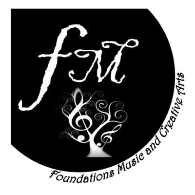
|
|
|
|
Re: My first Logo design
[Re: chaparral05]
#3257811
05/31/12 04:03 AM
|
Joined: Aug 2010
Posts: 1,649
Savage388
Pro Tracker
|
|
Pro Tracker
Joined: Aug 2010
Posts: 1,649 |
Looks professional to me. Good luck. 
ODERINT DUM METUANT
|
|
|
|
Re: My first Logo design
[Re: Savage388]
#3257818
05/31/12 04:11 AM
|
Joined: Dec 2008
Posts: 2,179
.308TAC
Veteran Tracker
|
|
Veteran Tracker
Joined: Dec 2008
Posts: 2,179 |
not bad, i'd lose the black fading, just make it all white on the music symbols. Simple, yet effective.
|
|
|
|
Re: My first Logo design
[Re: .308TAC]
#3258030
05/31/12 11:39 AM
|
Joined: Feb 2010
Posts: 6,164
Chief Joe
THF Trophy Hunter
|
|
THF Trophy Hunter
Joined: Feb 2010
Posts: 6,164 |
"It is the same boiling water that softens the rice, which hardens the egg." It's not always about the circumstances, but what you are made of....
|
|
|
|
Re: My first Logo design
[Re: Chief Joe]
#3258102
05/31/12 12:28 PM
|
Joined: Feb 2008
Posts: 3,306
txvarminter
Veteran Tracker
|
|
Veteran Tracker
Joined: Feb 2008
Posts: 3,306 |
It looks pretty good
If you like the fading keep it just add some shading to the lettering above. I think it makes the letting look like an afterthought to have the lettering so bold. You also might look at taking the lettering off the symbol and make the music tree a little bigger I think that would look sharp also. Just my .02 since you ask
|
|
|
|
Re: My first Logo design
[Re: txvarminter]
#3258299
05/31/12 02:11 PM
|
Joined: Jul 2011
Posts: 206
chaparral05
OP
Woodsman
|
|
OP
Woodsman
Joined: Jul 2011
Posts: 206 |
Thanks for the suggestions and complements. My wife and I debated some of the same thoughts. I'm planning on makeing a couple more over the next week, so we'll see what she finally chooses.
|
|
|
|
Re: My first Logo design
[Re: chaparral05]
#3258331
05/31/12 02:24 PM
|
Joined: Oct 2009
Posts: 5,445
BOONER
THF Trophy Hunter
|
|
THF Trophy Hunter
Joined: Oct 2009
Posts: 5,445 |
I dont know what it is called, but the FM needs cleaner lines IMO. Everything else looks great.
|
|
|
|
Re: My first Logo design
[Re: BOONER]
#3258415
05/31/12 02:47 PM
|
Joined: Mar 2011
Posts: 13,017
NEVAGA
THF Celebrity
|
|
THF Celebrity
Joined: Mar 2011
Posts: 13,017 |
|
|
|
|
Re: My first Logo design
[Re: BOONER]
#3258426
05/31/12 02:49 PM
|
Joined: Jan 2008
Posts: 18,776
HuntingTexas
THF Celebrity
|
|
THF Celebrity
Joined: Jan 2008
Posts: 18,776 |
I dont know what it is called, but the FM needs cleaner lines IMO. Everything else looks great.
" In God We Trust "
|
|
|
|
Re: My first Logo design
[Re: BOONER]
#3259032
05/31/12 06:18 PM
|
Joined: Nov 2010
Posts: 5,275
jeepercreeper
THF Trophy Hunter
|
|
THF Trophy Hunter
Joined: Nov 2010
Posts: 5,275 |
I dont know what it is called, but the FM needs cleaner lines IMO. Everything else looks great. Agreed. Just because it's somewhat hard to read the FM letters for me. Outside of that, looks cool.
|
|
|
|
Re: My first Logo design
[Re: jeepercreeper]
#3259054
05/31/12 06:26 PM
|
Joined: Nov 2006
Posts: 1,599
jaymz
Pro Tracker
|
|
Pro Tracker
Joined: Nov 2006
Posts: 1,599 |
A few thoughts.. if the business is Foundation Music and Creative Arts, why the FM only?
You might be able to do something interesting with the FMCA (or FM&CA) letters.
Not a fan of the distressed letters, but the logo with the tree and treble clefs are cool!
|
|
|
|
Re: My first Logo design
[Re: jaymz]
#3259071
05/31/12 06:33 PM
|
Joined: Jul 2006
Posts: 110,802
dogcatcher

THF Celebrity
|
|
THF Celebrity
Joined: Jul 2006
Posts: 110,802 |
Make sure you can enlarge and reduce the logo. A good logo will look good on a banner and it also has to look good on something as small as a business card. It has to be readable in all kind of sizes.
Combat Infantryman, the ultimate hunter where the prey shoots back.
_____________"Illegitimus non carborundum est"_______________![[Linked Image]](https://texashuntingforum.com/forum/pics/usergals/2018/09/full-3152-162968-charge_air_assault.jpg)
|
|
|
|
Re: My first Logo design
[Re: jaymz]
#3259423
05/31/12 08:46 PM
|
Joined: Jul 2011
Posts: 206
chaparral05
OP
Woodsman
|
|
OP
Woodsman
Joined: Jul 2011
Posts: 206 |
if the business is Foundation Music and Creative Arts, why the FM only? She like the F in that script because it looks like a forte. Right now she's focusing mainly on the music side of the school. She is offering early childhood music classes, piano prep. classes, private piano and theory lessons, and baby sign classes. She has plans to expand into creative drama and improv classes later on. She set up the business name planing for the future growth. Keep the ideas coming you guys are great.
|
|
|
|
Re: My first Logo design
[Re: chaparral05]
#3259437
05/31/12 08:50 PM
|
Joined: Nov 2006
Posts: 1,599
jaymz
Pro Tracker
|
|
Pro Tracker
Joined: Nov 2006
Posts: 1,599 |
Ah well there you go.
My first Piano teacher was in Lubbock on 15th street between Slide and Hardwick elementry.
That was 1979 though.
|
|
|
|
Re: My first Logo design
[Re: jaymz]
#3259449
05/31/12 08:54 PM
|
Joined: Jul 2011
Posts: 206
chaparral05
OP
Woodsman
|
|
OP
Woodsman
Joined: Jul 2011
Posts: 206 |
Was it Dr. Holmes? She lives over there somewhere. Great Lady.
|
|
|
|
Re: My first Logo design
[Re: chaparral05]
#3259455
05/31/12 08:56 PM
|
Joined: Nov 2006
Posts: 1,599
jaymz
Pro Tracker
|
|
Pro Tracker
Joined: Nov 2006
Posts: 1,599 |
I dont think so. I would probably remember if someone said her name, but I've had a few beers since then 
|
|
|
|
Re: My first Logo design
[Re: jaymz]
#3260194
06/01/12 01:58 AM
|
Joined: Jul 2006
Posts: 14,278
Fooshman
THF Celebrity
|
|
THF Celebrity
Joined: Jul 2006
Posts: 14,278 |
I'd clean up the edges of the main letters.
|
|
|
|
Re: My first Logo design
[Re: Fooshman]
#3260442
06/01/12 03:38 AM
|
Joined: Dec 2011
Posts: 2,570
AaronM58
Veteran Tracker
|
|
Veteran Tracker
Joined: Dec 2011
Posts: 2,570 |
|
|
|
|
Re: My first Logo design
[Re: AaronM58]
#3261882
06/01/12 06:36 PM
|
Joined: Jul 2008
Posts: 6,441
Chopped54
THF Trophy Hunter
|
|
THF Trophy Hunter
Joined: Jul 2008
Posts: 6,441 |
Unless it was going to be in the upper left hand corner of a letterhead, website, business card, etc I think it will look off canter.
Otherwise looks good, what a professional logo should look like.
Wealth is of the heart and mind and not of the pocket
|
|
|
|
Re: My first Logo design
[Re: Chopped54]
#3279347
06/08/12 11:27 AM
|
Joined: Nov 2011
Posts: 333
jono7183
Bird Dog
|
|
Bird Dog
Joined: Nov 2011
Posts: 333 |
"People sleep peacefully at night because there are a few rough men prepared to do violence in their behalf" www.cantuknives.com
|
|
|
|
Re: My first Logo design
[Re: jono7183]
#3279719
06/08/12 02:24 PM
|
Joined: Feb 2008
Posts: 6,410
father of 4
THF Trophy Hunter
|
|
THF Trophy Hunter
Joined: Feb 2008
Posts: 6,410 |
|
|
|
Moderated by bigbob_ftw, CCBIRDDOGMAN, Chickenman, Derek, DeRico, Duck_Hunter, hetman, jeh7mmmag, JustWingem, kmon11, kry226, kwrhuntinglab, Payne, pertnear, rifleman, sig226fan (Rguns.com), Superduty, TreeBass, txcornhusker
|


![[Linked Image]](https://filedn.com/lueWmb5Q4dR5HbLjYC8Moxp/smallersig.gif)