Texas Hunting Forum

What do you think of this logo?

Posted By: Son of a Blitch

What do you think of this logo? - 09/04/15 05:50 PM

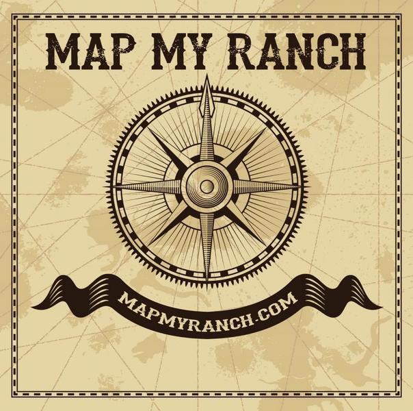
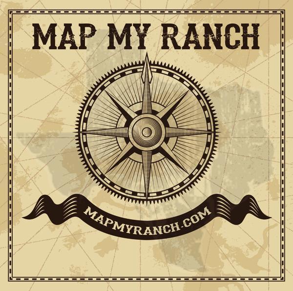
We're working on getting a new logo together for Map My Ranch. This one was a draft mock up...what do you think?


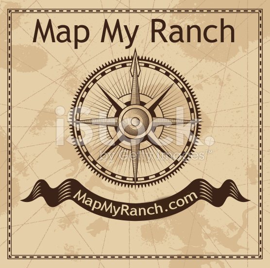
We'd likely do a different font and a better job of centering the website url...just wanting to get feedback on the general layout/design.
Posted By: Son of a Blitch

Re: What do you think of this logo? - 09/04/15 05:51 PM

and the iStock watermark would be gone, of course.
Posted By: Mako My Day

Re: What do you think of this logo? - 09/04/15 06:11 PM

It looks good, I might make the Map my Ranch at the top a little bolder(or thicker) font
Posted By: Ramsey

Re: What do you think of this logo? - 09/04/15 06:30 PM

Like It
Posted By: Cast

Re: What do you think of this logo? - 09/04/15 06:32 PM

Thumbs UP!
Posted By: Brother in-law

Re: What do you think of this logo? - 09/04/15 07:11 PM

Thumbs down for me

Not sure why, maybe a little vanilla
Posted By: Son of a Blitch

Re: What do you think of this logo? - 09/04/15 07:19 PM

Thanks for the feedback...How's this version? Think maybe the cowboy type font might come in handy for the design...

Posted By: Cast

Re: What do you think of this logo? - 09/04/15 07:23 PM

Maybe a Texas map behind it?
Posted By: Son of a Blitch

Re: What do you think of this logo? - 09/04/15 07:52 PM


Cast - something like this?

Posted By: BuckRage

Re: What do you think of this logo? - 09/04/15 07:55 PM

looks good. I've never liked the banner type clip art but It looks good especially with Texas in the background up
Posted By: Cast

Re: What do you think of this logo? - 09/04/15 08:33 PM

Thumbs UP!
Posted By: stxranchman

Re: What do you think of this logo? - 09/04/15 09:52 PM

I would run the "Map My Ranch" in an arc shape instead of straight line.
Posted By: QuitShootinYoungBucks

Re: What do you think of this logo? - 09/04/15 09:52 PM

NICE!!!
Posted By: Halfadozen

Re: What do you think of this logo? - 09/04/15 09:59 PM

Shrink the compass a bit so the north arrow is right in the middle of the word "MY". Like the font change. Also you might think about changing the border to barbed wire. On the ribbon with your URL maybe look at ends being more of a bird feather? Biggest thing to keep in mind is the logo has to work in all aspects of media. Print, digital, etc and sizing resolution needs to have proper aspect.
Posted By: cannon88

Re: What do you think of this logo? - 09/04/15 10:09 PM

Way too busy to me.
Posted By: rickym

Re: What do you think of this logo? - 09/04/15 10:30 PM

up
© 2024 Texas Hunting Forum