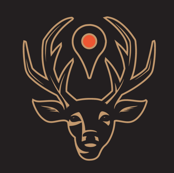
Thanks for the feedback - to answer you questions, the teardrop icon is basically the google pin drop - it is used when you are wanting to get direction on digital maps, also used in some print maps these days. Trying to blend "maps" and "ranches" with the fusion of those two.
And, I can see the Jager connection there. Hadn't "seen" that until you mentioned it.
I appreciate the honesty and welcome other thoughts/feedback.
We've gone through a few logos so far, and really just haven't been fully happy with them, (though I designed each one myself, including our current one). Decided to give some friends the reigns and see what they came up with. We are trying to convey that we make maps for ranches...98% of our customers are hunters, so the deer imagery seems to get the attention of the majority of our customers, as something they can connect with. Trying to convey "MAPS" has been a tough one. We have some really big things happening with our company right now, and we want to settle with a logo before this next big marketing campaign we're about to start.
Some say we shouldn't limit ourselves to marketing that we map hunting ranches. We are about to launch Map My Lake, and we have another company in the works to map other types of properties. We've found it easier to have individual sites and companies under one umbrella, were each can have a particular market to address...makes it easier and more focused for advertising and business partnerships.
We have another friend/designer working on touching up the designs below. I posted these the other week, and should have final drafts with updates on these below soon. Just wanted to share/get feedback on the images above, since they just hit my inbox this morning. (Antlers will be redesigned on the below images)